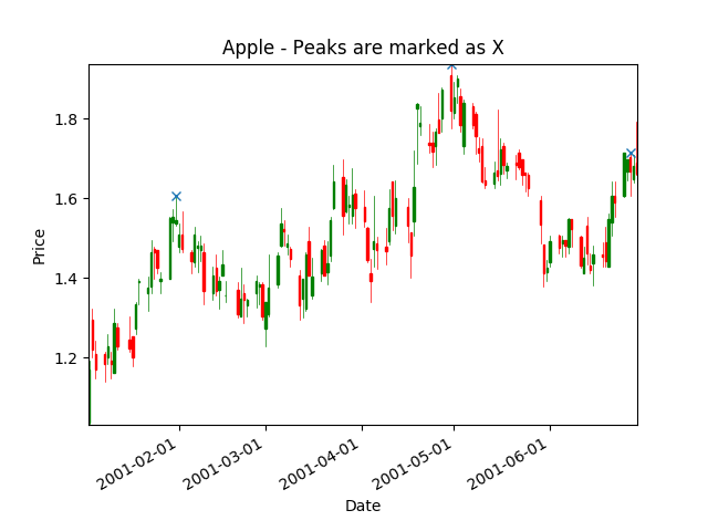
Overview
Use PeakUtils to find peaks in a graph. For more informations about different peaks implementations, see https://blog.ytotech.com/2015/11/01/findpeaks-in-python.
Update 2019-04-11: A better way to find peaks is to use scipy.signal.argrelextrema() function.
Requirement
apple.csvcontaining Apple stock prices data. See sample data section below for more details. Each column is separated by a tab.- You need
mpl_financePython package to draw candlestick chart. See here for instructions on how to installmpl_finance.
Installation
# Download PeakUtils zip file from https://bitbucket.org/lucashnegri/peakutils/downloads/
pip install lucashnegri-peakutils-XXXXXX.zip
Usage
Look at the code below at the Peak section. It is very simple to use the PeakUtils library.
#!/usr/bin/python3

import matplotlib
matplotlib.use('Agg') # Bypass the need to install Tkinter GUI framework

# Avoid FutureWarning: Pandas will require you to explicitly register matplotlib converters.
from pandas.plotting import register_matplotlib_converters
register_matplotlib_converters()

import pandas as pd
from mpl_finance import candlestick_ohlc

import matplotlib.pyplot as plt
import matplotlib.dates as mdates

import peakutils

# Load data from CSV file.
##########################
my_headers = ['date', 'open', 'high', 'low', 'close', 'volume']
my_dtypes = {'date': 'str', 'open': 'float', 'high': 'float', 'low': 'float',
                                                'close': 'float', 'volume': 'int'}
my_parse_dates = ['date']
loaded_data = pd.read_csv('apple.csv', sep='\t', header=1, names=my_headers,
                            dtype=my_dtypes, parse_dates=my_parse_dates)


# Convert 'Timestamp' to 'float'.
#   candlestick_ohlc needs time be in float days format - see date2num.
loaded_data['date'] = [mdates.date2num(d) for d in loaded_data['date']]

# Re-arrange so that each line contains values of a day: 'date','open','high','low','close'.
quotes = [tuple(x) for x in loaded_data[['date','open','high','low','close']].values]

# Plot candlestick.
##########################
fig, ax = plt.subplots()
candlestick_ohlc(ax, quotes, width=0.5, colorup='g', colordown='r');

# Peak
############
# Find peak points from high values.
peak_indexes = peakutils.indexes(loaded_data['high'].values, thres=0.5, min_dist=30)
peak_x = loaded_data['date'].values[peak_indexes]
peak_y = loaded_data['high'].values[peak_indexes]

plt.plot(peak_x, peak_y, "x") # Mark 'X' as peaks.


# Customize graph.
##########################
plt.xlabel('Date')
plt.ylabel('Price')
plt.title('Apple - Peaks are marked as X')

# Format time.
ax.xaxis_date()
ax.xaxis.set_major_formatter(mdates.DateFormatter("%Y-%m-%d"))

plt.gcf().autofmt_xdate()   # Beautify the x-labels
plt.autoscale(tight=True)

# Save graph to file.
plt.savefig('peak.png')
Chart output

apple.csv sample data
date open    high    low close   volume
2001-01-02  1.062500    1.089286    1.040179    1.062500    113078000
2001-01-03  1.035714    1.191964    1.031250    1.169643    204268400
2001-01-04  1.295757    1.321429    1.200893    1.218750    184849000
2001-01-05  1.209821    1.241071    1.147321    1.169643    103089000
2001-01-08  1.209821    1.213164    1.138393    1.183036    93424800

