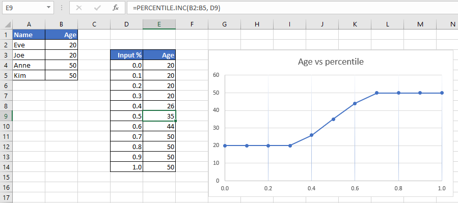
A percentile graph is a chart that shows the progression frequency of categories of data. For example, in a country, you would like to know what is the age of 10% of your population? 20%, 30%, 40% and so on?
| Name | Age |
|---|---|
| Eve | 20 |
| Joe | 20 |
| Anne | 50 |
| Kim | 50 |
In MS Excel, the score of a percentile is calculated using the following functions:
- PERCENTILE: This function is deprecated. It is still available for backward compatibility. Use the other 2 functions below.
- PERCENTILE.EXC: This function will return k-th percentile of values in a range, where k is in the range 0..1, exclusive.
- PERCENTILE.INC: This function will return k-th percentile of values in a range, where k is in the range 0..1, inclusive.
I chose to use PERCENTILE.INC(array, k) function. Here are the results for every 10%, from 0% to 100%.

From the percentile graph generated, we can say the followings:
- 0% of the population is less than 20 years old. Or, no one has less than 20 years old.
- 50% of the population is less than 35 years old.
- 100% of the population is less than 51 years old. Or, no one is older than 50 years old.

